







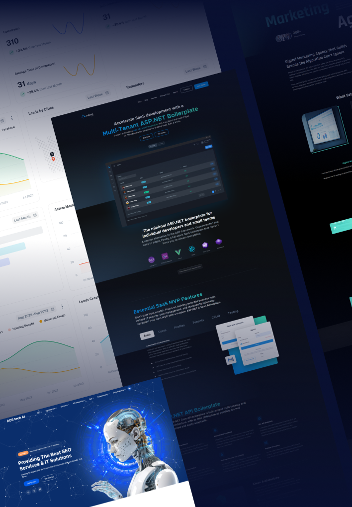
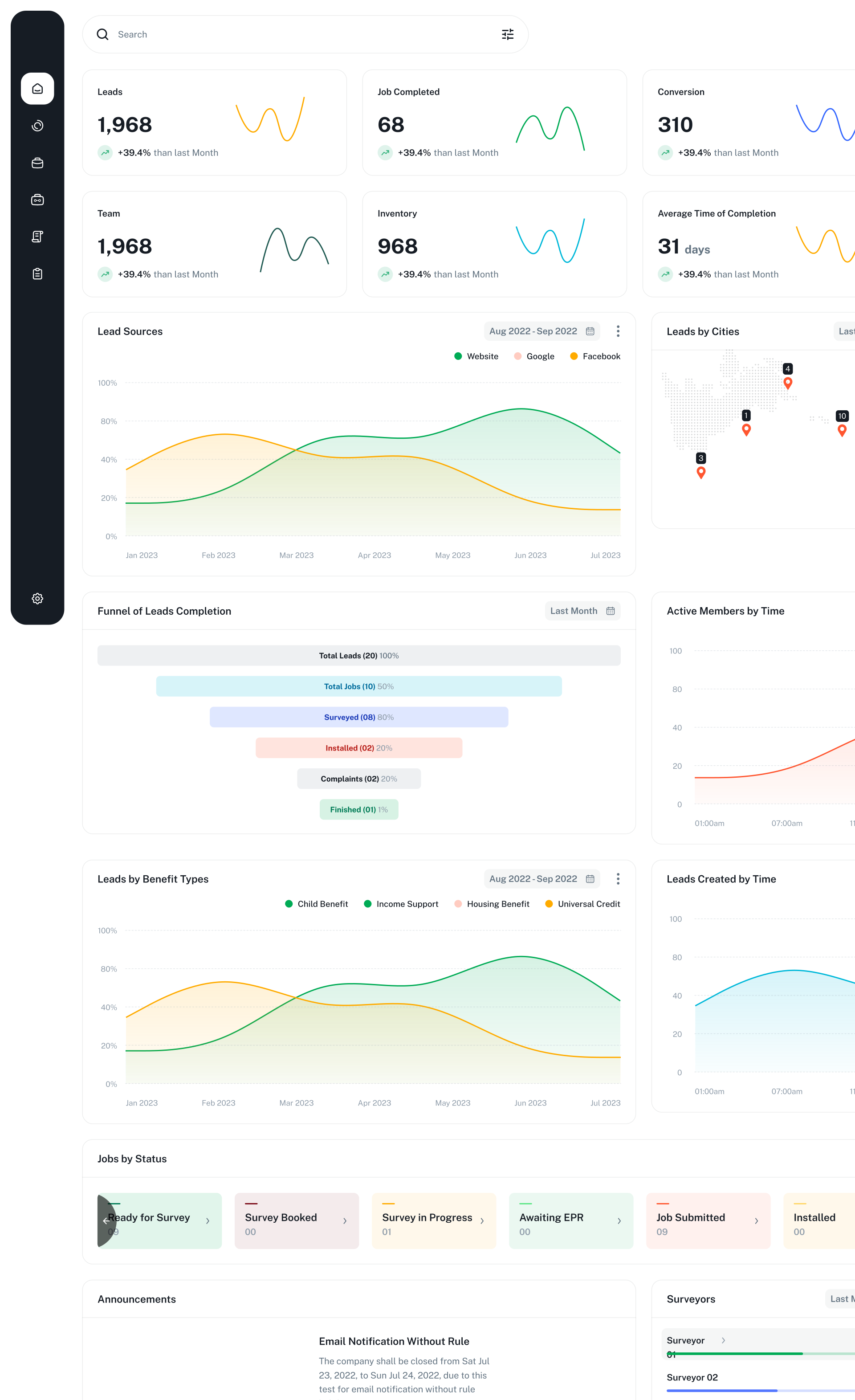

Now you can transform user experiences with responsive web design services that convert across all devices. From mobile-optimised web development to adaptive website design.


78.3%
Mobile traffic conversion increase
100%
Cross-device compatibility
65%
Faster mobile loading speeds achieved
89%
User engagement improvement
3.4X
Revenue increase from mobile users
Our mobile-first website design process begins with smartphone user behavior analysis to create optimal experiences for the 79% of users who browse on mobile devices. We implement responsive web design services that prioritise mobile performance while ensuring seamless scalability to larger screens. Our strategic approach includes touch-friendly interface design, thumb-zone optimisation, and mobile-specific navigation patterns that reduce bounce rates and increase engagement.
Using advanced CSS Grid, Flexbox, and modern responsive techniques, we ensure your website delivers consistent brand experiences whether viewed on smartphones, tablets, or desktop computers. Our cross-device web design approach includes progressive enhancement strategies, flexible image optimisation, and adaptive typography systems.
We implement advanced performance optimisation techniques including lazy loading, critical CSS extraction, and mobile-specific caching strategies that ensure your website loads quickly even on slower 3G connections. Our development process includes mobile performance budgets, image optimisation for retina displays, and progressive web app features.
We design thumb-friendly navigation systems, optimised form layouts, and mobile-specific call-to-action placements that maximise engagement and reduce friction in the user journey. Our mobile UX approach includes gesture-based interactions, micro-animations that provide feedback, and simplified content hierarchies.
We conduct comprehensive responsive design testing, touch interaction validation, and mobile usability audits that identify and resolve potential issues before launch. Our testing process includes real-device testing, automated responsive testing tools, and continuous monitoring systems that track mobile performance metrics.
1
Our team conducts detailed mobile analytics review, competitor mobile experience analysis, and user persona development specifically focused on mobile behaviors and preferences. This research phase informs our responsive web design services strategy, ensuring that every design decision prioritises mobile user needs while supporting seamless scalability across all device categories and screen sizes for optimal user engagement and business results.
2
We develop adaptive website design concepts that maintain visual hierarchy and brand consistency across all device sizes while prioritising mobile usability and conversion optimisation. Through iterative design reviews and mobile usability testing, we refine touch interactions, navigation patterns, and content organization to ensure your fluid responsive layout delivers exceptional experiences that drive engagement and conversions regardless of device or screen orientation.
3
Our expert development team transforms approved mobile-first designs into high-performance, cross-device web solutions using advanced responsive development frameworks and modern CSS techniques. We implement fluid responsive layouts using CSS Grid, Flexbox, and progressive enhancement strategies that ensure optimal performance across all devices and browsers. Our mobile-optimised web development process includes advanced image optimisation, touch event handling, and mobile-specific performance optimisations.
4
Before launch, we conduct comprehensive mobile-friendly website development testing across hundreds of real devices, browsers, and network conditions to ensure flawless responsive performance and consistent user experiences. Our quality assurance process includes mobile usability testing, touch interaction validation, and performance optimisation under various mobile network scenarios. We implement advanced mobile analytics tracking, Core Web Vitals monitoring, and responsive design validation tools that provide immediate insights into mobile user behavior and performance metrics, ensuring your UX design for mobile delivers measurable results across all device categories.
5
Our post-launch support includes continuous mobile performance monitoring, responsive design optimisation, and strategic enhancement recommendations based on real mobile user data and behavior analytics. We provide comprehensive training on mobile performance management, ongoing technical support, and quarterly mobile optimisation reviews that identify new opportunities for improving mobile conversion rates and user satisfaction across the evolving device landscape.
Common questions about our Mobile-First & Responsive Design services.
Mobile-first design means we design your website for smartphones first and then adapt it for larger screens, which ensures the best experience for the majority of users.
Responsive design automatically adjusts your website's layout, images and text to fit any screen size, from phones to desktops.
We provide mobile-first architecture and UX design, fluid responsive layouts, performance-optimised mobile development, touch-friendly interface design, and testing and mobile-friendly validation.
Yes. Google uses mobile-first indexing, so a fast, mobile-friendly website supports better search rankings.
Yes. We can review your current site and redesign or rebuild it to work perfectly on all devices.
Still have questions? Call +44 808 160 7252 or email [email protected].